Process Work
Motifs: Olive Tree Branch, Olive Jug & Decoration Motif
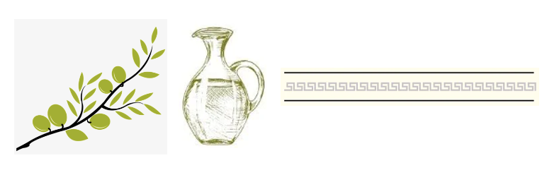
My inspiration behind this design is the Italian Tuscan vibe, all the while using my Arab heritage and background to create a more personal touch to it. I started by looking at the olive tree branch, a plant, that represents liberation, rebirth, renewal, and peace in Lebanon. In my country, it is renowned for its opulent olive orchards dating back centuries. The northern villages of Amioun and Bshaale are home to some of the oldest olive trees in the world, many of which date back at least 1,500 years.
To add more depth to it, I included the olive oil jug, which also has a meaning to the Lebanese population. Spirituality appears to flow through the branches of the olive tree. It has been used as a religious symbol of peace, life, fertility, and renewal. As well as, it is used in natural medications prescribed by ancient healers.
Additionally, the decorative motif adds to the whole design since it appears in a lot of Arab drawings and old tile drawings.
Altogether, my design gives off an Italian vibe all the while keeping true to my roots and origins. When I first started brainstorming ideas for my final design I knew I wanted an Italian vibe but I did not anticipate using olives as my main inspiration. I went on to research symbolic plants in my culture and discovered the importance of the olive branch as well as the olive oil.
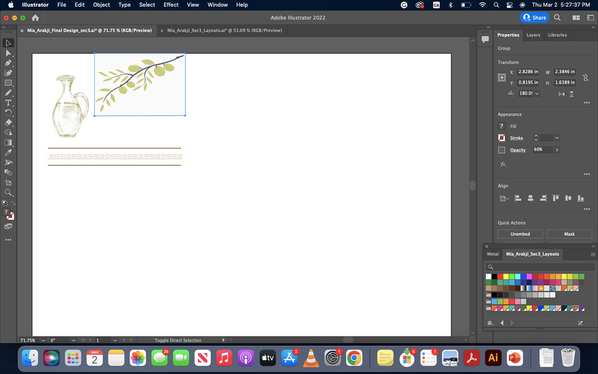
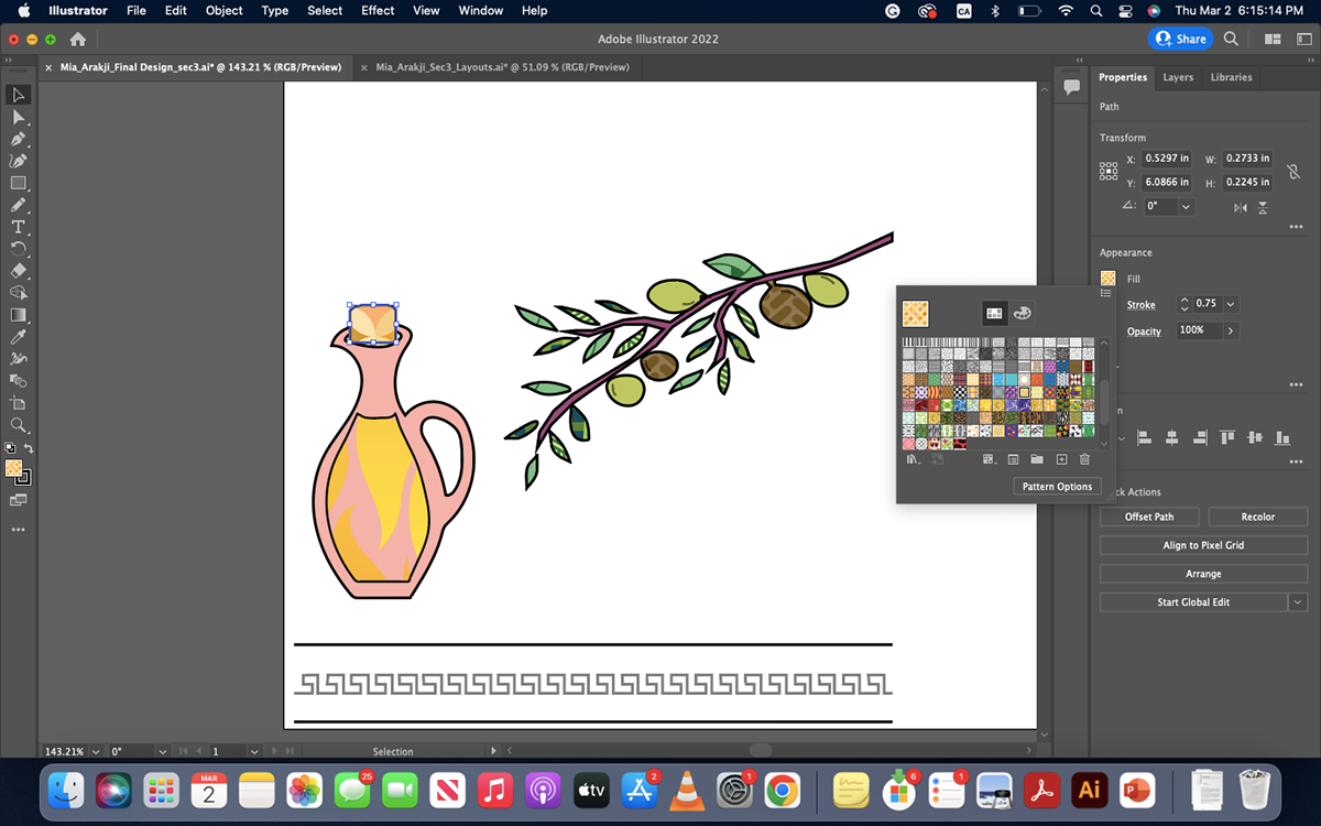
I started by adding the motifs and decreasing their opacity to 60% so that I can trace them and create my initial design layout. I took my time outlining them with the pen tool and then smoothing out the edges with the smooth tool. The olive branch took longer than I expected to outline with the pen tool and smooth the edges to create a circular shape.

It started coming together when I saw it without the original picture. I then proceeded to add some details on the olives to make them look livelier, by decreasing the opacity of the stroke to 50%, to make it less dominant than the outline. I also lowered the stroke of the pen tool to add more details such as the cover of the olive jug and the outline of where the oil is supposed to be. However, it was still missing the colors to give it more character.
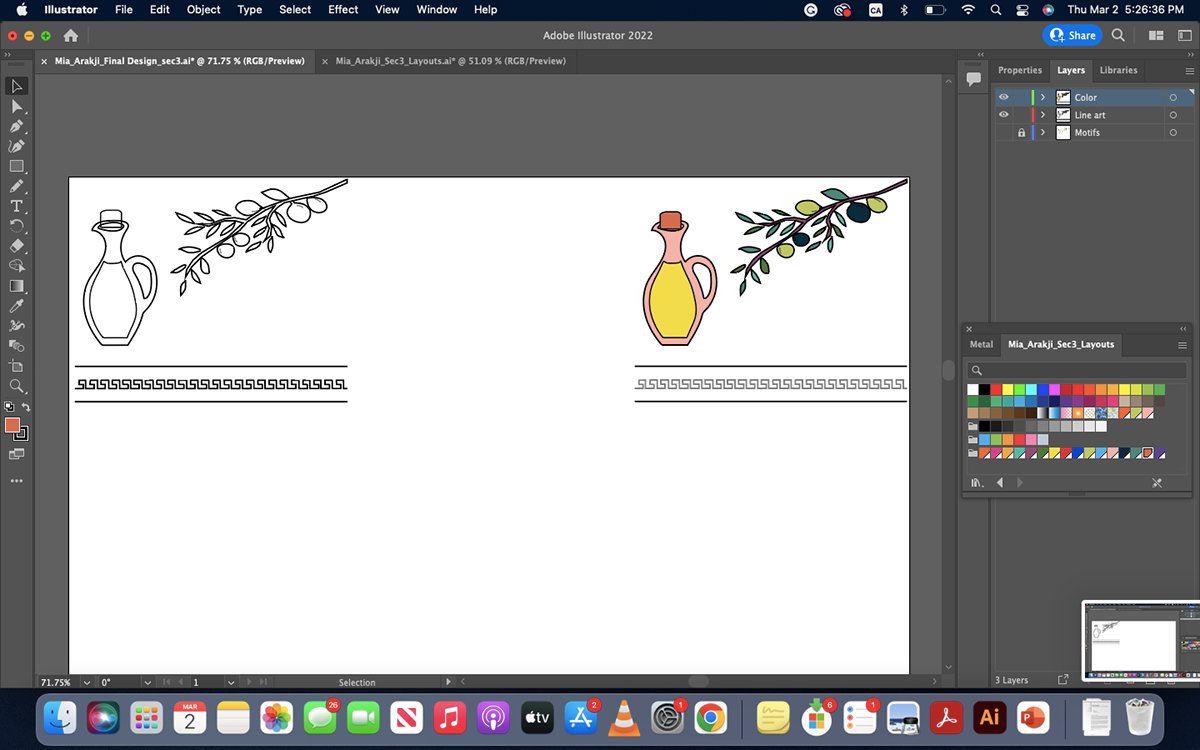
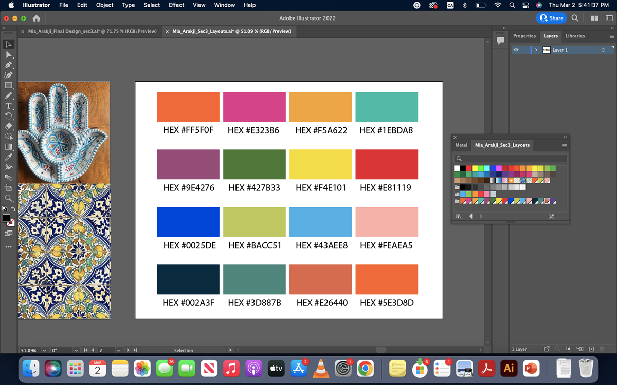
I proceeded to group the whole design and then I created a new layer, and copied and pasted the design onto the new layer to add colors to it. I started experimenting with different colors from the color swatches that I created in the Research and Process portion of this project. Finally, I felt comfortable with the color combinations that I picked. I used 8 colors from my color swatch for my color design (HEX #1EBDA8, HEX #9E4276, HEX427B33, HEX #F4E101, HEX #BACC51, HEX #FEAEA5, HEX #002A3F, HEX #3D887B, HEX #E26440)
Moreover, I created a new layer where I copied and pasted my colored design and started to play around with patterns to add texture to my design and to see what they would look like with my design.


The next step was creating a repeat design out of my motifs. I wanted to take the olive branch and oil jug and make a repeat pattern that translates the vibe I aimed for. I started by copying the motifs I was focusing on on a new layer and then turned them into a pattern swatch, by dragging and dropping the motif in the swatches panel. I proceeded to credit a rectangle where I intended to have the repeat design shown. To create this pretty pattern I played around with the swatch details such as the tile tool, tile type, and overlapping. To add color as a background for this design pattern, I drew a second rectangle overlapping with the first one, sent it to the back, and then changed the fill to this grayish blue that ties in the Italian vibe.

Following, I created a different colorway, using one of the schemes from the Munsell color wheel. I chose split complementary, colors purple, green, and yellow. I picked this combination since it goes with my inspiration board and the vibrant colors that I wanted to use to attract the younger demographic and relay with the pop art community.

I continued to create a repeat design out of my motifs' different color way. I wanted to take the olive branch and oil jug and make a repeat pattern that translates the vibe I aimed for using the new pop of color. I started by copying the motifs I was focusing on on a new layer and then turned them into a pattern swatch, by dragging and dropping the motif in the swatch panel. I proceeded to draw a rectangle where I intended to have the repeat design shown. to create this pretty pattern I played around with the swatch details such as the tile tool, type, and overlapping. To add color as a background for this design pattern, I drew a second rectangle overlapping the first one, sent it to the back, and then changed the fill to this nude beige that brought out the pop of color and gave the pop art vibe that I was intending for.


To finish off the repeat designs, I added a title for each color palette, Tuscany morning for the first one since it gives off an Italian morning, calm vibe all the while staying in touch with the meaning behind the olive tree branch and the olive oil jug. The second one I titled A pop of peace, playing on the words, a pop of color but instead of color I added the word peace since that is what the olive tree branch majorly represents, amongst other explanations for it. I also added the color palettes on the side using the rectangle tool that I split into 10 and 4 rows and then filled them out with their respective colors.

The final part is the non-directional design. I started by creating the borders from one of my motifs, a decoration motif, which appears in a lot of Arab drawings and old tile drawings.

Continued by adding a different color background, teal blue, by creating a rectangle and sending it to the back.

Next, I added the motif using the Bezold effect. I locked the background layer with the border, then created a new layer and named it the Bezold effect, afterwards I proceeded to copy my motif, the oil jug, grouped it, and then selected object > repeat > radial. In the options bar I entered 4, and the positioned the four repeated design in the artboard to my liking. Then I selected the object and clicked expand in the object tab. Continued to change all the strokes to 0.5 pt to give it a calmer look.

The next step was adding my olive tree branches. I copied and pasted them and played around with their positions to create a nice-looking piece.

I tweaked around with the colors and patterns to get a background I was satisfied with and that relayed best what vibe I was mostly going with.

The last detail was adding in my initials and signing my work in the bottom right corner using the pen tool in Illustrator. I played around with the dot between my initials and used a pattern to fill it.

